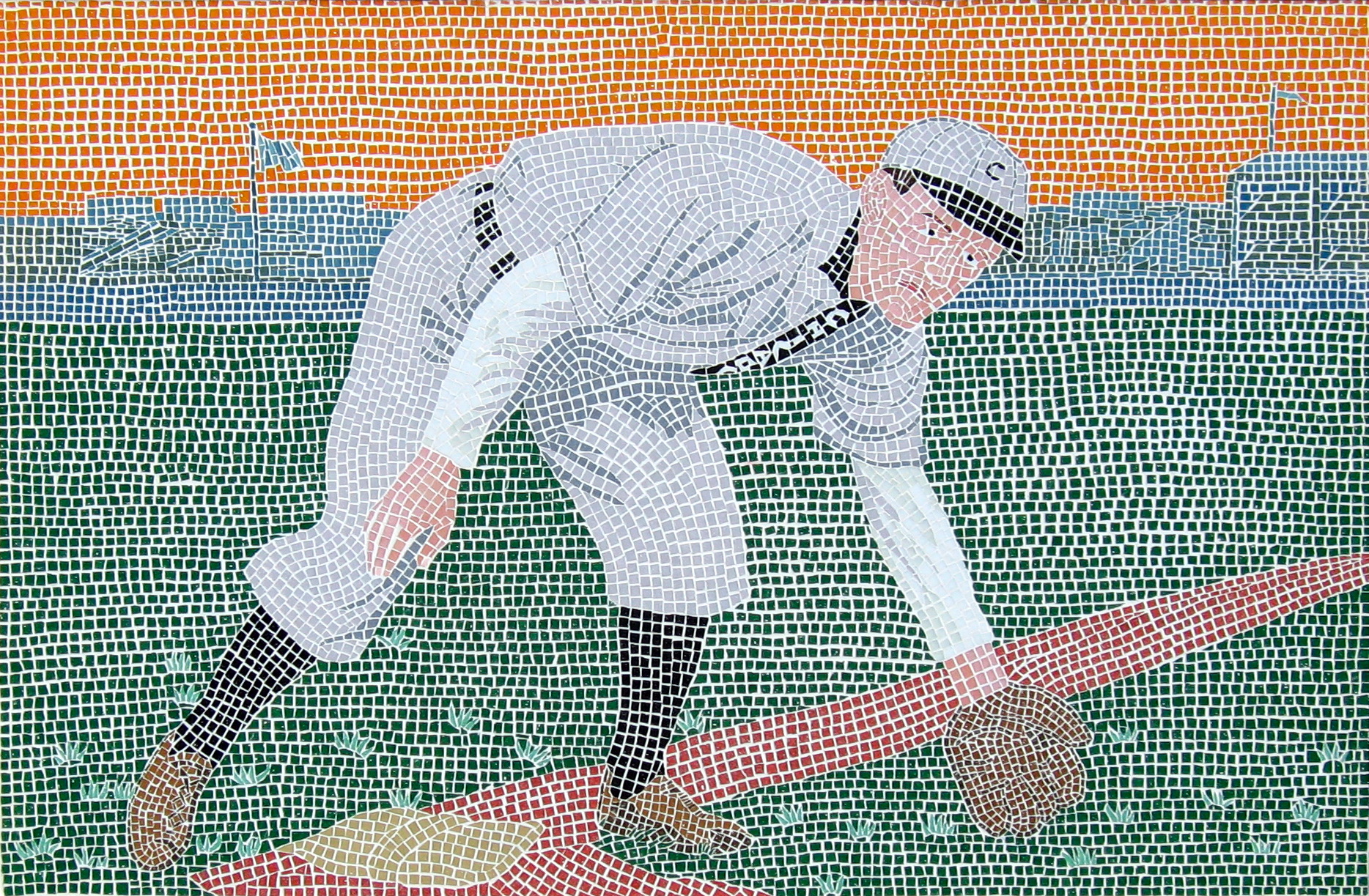
23 Apr Johnny Evers Mosaic, Centerpiece of the Chicago Cubs Triptych
Johnny Evers Mosaic Portrait, 2006
vitreous glass mosaic, steel frame.
48″ H x 60″ W x 1.5″ D
Commission
It’s nearly impossible to reduce a six foot wide mosaic to a 600 pixel wide image and get it to look the way it should! The grout lines tend to create a moiré distortion that obscures the detail. Click on the image above to see a larger (1863 wide x 1223) version. You might prefer to download it to your computer and view it in an image viewer that gives you more control than the browser.
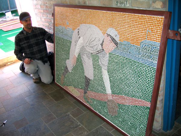
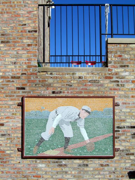
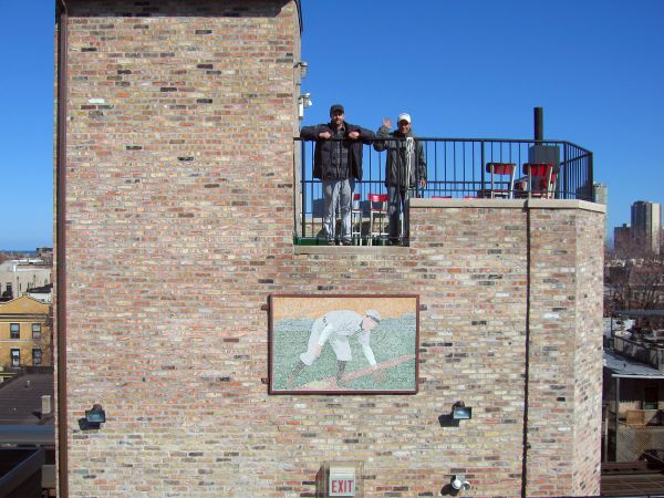
Below are a few pictures from the installation of the piece. The first is Tony Racky admiring his new mosaic. You can see from the photo that the mosaic is pretty much life-size. The next two pics show the mosaic on the wall of the BaseBall Club with Tony and Gil to give a sense of scale.
Installing a 4 x 6 foot mosaic panel 50 feet in the air on a cold and windy Chicago day is no real picnic!
I’m not sure how much this piece weighs, but I’d guess that it’s around 250 pounds. No matter how heavy a piece like this is, it will act like a sail when you have a stiff Chicago wind. We were lucky enough to have the railing right above where we wanted to hang it, so we used ropes to haul it up and tied it off. Then I climbed to the top of the best ladder on site and basically used the wind to hold me in place while I held the mosaic in place and reached to the limits of my ability to drill the first two holes for the concrete anchors. It’s hard to drill over your head to begin with, but try it with a 24V hammer drill! Yikes.
Fortunately, everything went pretty well and we were able to install the mosaic without injury to art or person. The installation was done on my way back from SXSW and since these things always take longer than expected, I had to hit the road before the two smaller panels were hung. Next time I’m in Chicago, I’ll try to swing by and get a photo of the entire set in place.
Tinker to Evers to Chance: A Tribute to the Chicago Cubs
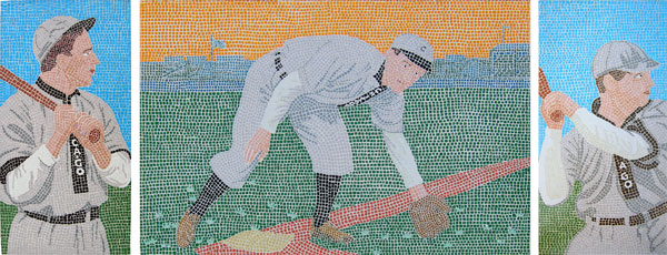
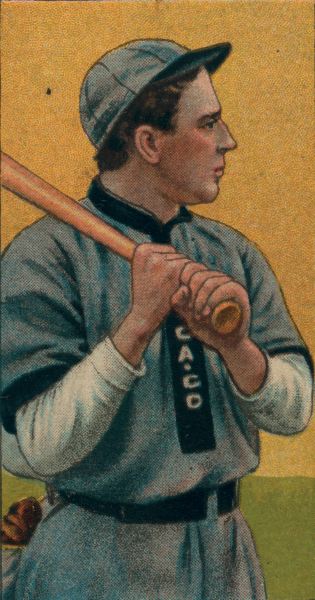
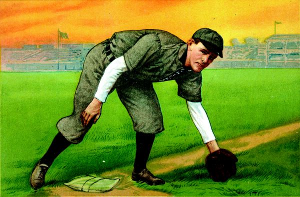
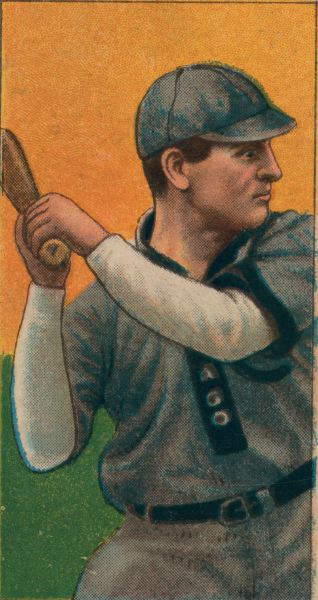
The image above shows the completed triptych. The images below show the baseball cards that the mosaics were based on (circa 1910-11 found at the Library of Congress’ Special Collections website). They all shared the orange sky, but since the project was done in stages over a period of a few years, I thought I would give the smaller ones blue skies to avoid confusing people. On the final piece I went with the orange, which I really like. The contrast between the blue and orange works really well.


